0
$0.00
Mini Cart
Empty cart
No products in the cart.
In today’s competitive business landscape, first impressions matter more than ever. Whether you’re handing out business cards at a networking event, distributing flyers at a trade show, or unveiling a new banner at your storefront, the quality of your printed materials speaks volumes about your brand.
Yet, despite the critical role that print plays in marketing and branding, many businesses continue to make avoidable printing design mistakes that undermine their professional image and waste valuable resources.
At Fine Print Solution, we’ve witnessed countless businesses struggle with design errors that could have been easily prevented with the right knowledge and guidance.
As we move through 2025, understanding these common pitfalls and learning how to avoid them can save your business time, money, and reputation. Let’s explore the top five printing design mistakes businesses should steer clear of this year.
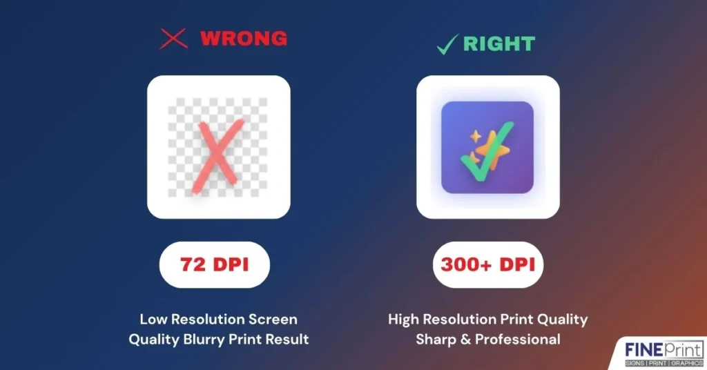
One of the most prevalent printing design mistakes businesses make is using low-resolution images in their print materials. What looks crisp and clear on your computer screen can turn into a pixelated disaster when printed on business cards, brochures, or banners.
The Problem:
Digital screens typically display images at 72 DPI (dots per inch), while professional printing requires a minimum of 300 DPI for sharp, high-quality results. When businesses pull images from websites or use smartphone photos without proper editing, the final printed product often appears blurry, unprofessional, and damages brand credibility.
The Solution:
Always use high-resolution images specifically prepared for print. If you’re working with photographers or designers, ensure they provide files at 300 DPI or higher. For logos and graphics, vector formats (AI, EPS, or PDF) are ideal as they can be scaled to any size without losing quality. At Fine Print Solution, our design support team can help assess your image quality before printing and recommend adjustments to ensure optimal results.
Business Printing Tips:
Create a digital asset library with print-ready versions of your logo, product images, and brand graphics. Invest in professional photography for key marketing materials, and always request high-resolution files from your graphic designer.
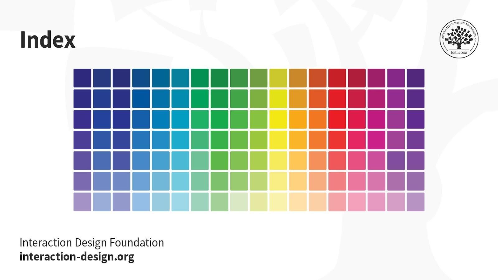
Color inconsistency ranks among the most frustrating design errors to avoid in commercial printing. Many businesses design their materials in RGB (Red, Green, Blue) color mode—the standard for digital displays—only to discover that their printed materials look completely different from what they saw on screen.
The Problem:
RGB colors appear vibrant on backlit screens but can’t be accurately reproduced in print, which uses CMYK (Cyan, Magenta, Yellow, Black) color mode. This discrepancy often results in printed materials that look dull, washed out, or feature entirely different colors than intended. For businesses with specific brand colors, this inconsistency can damage brand recognition and appear unprofessional.
The Solution:
Always design print materials in CMYK color mode from the start. If you have established brand colors, create a color guide that includes both Pantone (PMS) and CMYK values to ensure consistency across all printed materials. Request physical color proofs before running large print jobs, especially for business-critical materials like packaging or promotional banners.
2025 Printing Trends:
More businesses are adopting comprehensive brand style guides that include specific printing instructions and color specifications. This forward-thinking approach ensures consistency across all marketing channels, from digital to print.
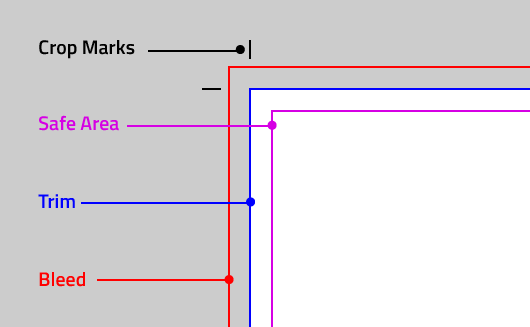

Even experienced marketers can overlook technical printing requirements like bleed, margins, and safe zones—leading to printed materials with cut-off text, awkward white borders, or poorly positioned design elements.
The Problem:
Bleed refers to the extra area around your design that extends beyond the final trim size. Without proper bleed (typically 3mm or 1/8 inch), your printed materials may have unwanted white borders when trimmed. Conversely, placing important text or logos too close to the edge without respecting safe zones can result in critical information being cut off during the trimming process.
The Solution:
Always design with bleed in mind, extending background colors and images beyond the trim line. Keep all essential text, logos, and design elements within the safe zone (typically 3-5mm from the trim edge). Use templates provided by your printing company—at Fine Print Solution, we offer custom templates for all our products, from business cards to presentation folders, ensuring your designs meet technical specifications.
Business Printing Tips:
Before sending files to print, zoom out and review your design at actual size. Check that no important elements are positioned too close to edges, and ensure backgrounds extend fully to the bleed line.

Typography is both an art and a science in print design. Unfortunately, many businesses commit printing design mistakes related to font selection, sizing, and readability that diminish the effectiveness of their printed materials.
The Problem:
Common typography errors include using too many different fonts, selecting fonts that are too small or too decorative to read clearly, failing to establish proper hierarchy, and choosing fonts that don’t complement the brand personality. Additionally, some fonts that look great on screen don’t translate well to print, particularly at small sizes on materials like business cards or labels.
The Solution:
Limit your design to 2-3 complementary fonts maximum—typically one for headlines and one for body text. Ensure minimum font sizes meet readability standards: at least 8-10 points for body text and never smaller than 6 points for fine print. Establish clear visual hierarchy using font weight, size, and spacing. Always embed or outline fonts when submitting files to prevent font substitution issues during printing.
Design Errors to Avoid:
Steer clear of overly decorative script fonts for large blocks of text, extremely thin fonts that may not print clearly, and font colors with insufficient contrast against the background. For outdoor signage like banners and roll-up stands, increase font sizes significantly to ensure readability from a distance.
The final printing design mistake businesses often make is underestimating the importance of paper selection and finish. The substrate you choose dramatically affects how your design looks, feels, and performs—yet many businesses default to the cheapest option or don’t consider how paper choice impacts their message.
The Problem:
Using inappropriate paper stock can undermine your design’s impact and professional appearance. Thin, flimsy paper for business cards suggests low quality, while glossy finishes on materials with heavy text can create glare and reduce readability. Additionally, certain designs and color schemes work better with specific paper finishes and weights.
The Solution:
Match your paper selection to your purpose and brand positioning. For premium business cards, opt for thicker cardstock (14pt-16pt minimum) with a finish that complements your design—matte for sophisticated, understated elegance, or glossy for vibrant, eye-catching appeal. For brochures and flyers, consider coated paper for photograph-heavy designs and uncoated paper when you want a more natural, textured feel that’s easier to write on.
2025 Printing Trends:
Sustainable printing is increasingly important to consumers. Eco-friendly paper options, including recycled stocks and FSC-certified papers, are becoming standard offerings. At Fine Print Solution, we provide multiple paper options and premium finishes to suit every project need and budget, with expert guidance to help you make the best choice.
Business Printing Tips:
Request sample packs from your printing provider to feel different paper stocks and finishes before making final decisions. For important projects like customized packaging or presentation folders, consider ordering a single proof on your chosen substrate to evaluate how your design translates to the physical product.
Avoiding these common printing design mistakes can significantly enhance your marketing effectiveness and brand perception. Quality printed materials remain powerful tools for business growth, customer engagement, and brand building—when executed correctly.
At Fine Print Solution, we understand that navigating printing specifications can be overwhelming, especially if design isn’t your expertise. That’s why we offer comprehensive design support to help businesses create print-ready files that meet technical requirements while effectively communicating their brand message. With modern printing technology, flexible quantities, custom sizes, and quick delivery, we’re your professional and reliable printing partner for all your marketing and branding needs.
Whether you need business cards that make lasting impressions, banners that capture attention, or customized packaging that elevates your product presentation, understanding and avoiding these design errors to avoid will ensure your investment in print marketing delivers maximum return.
Ready to take your printed materials to the next level? Contact Fine Print Solution at info@fineprintsolution.com or call +1 604-503-1117 to discuss your project. Visit our website to explore our full range of services, from sign boards to certificates, and discover how premium-quality printing can transform your business communication.
The most common printing design mistakes small businesses make include using low-resolution images that appear pixelated when printed, designing in RGB instead of CMYK color mode, ignoring bleed and margin requirements, choosing unreadable fonts or font sizes, and selecting inappropriate paper stocks.
These business printing tips can help: always use 300 DPI images, design in CMYK, include proper bleed, maintain readable typography, and consult with professional printers about paper selection. Following 2025 printing trends, businesses should also prioritize brand consistency and sustainability in their print choices.
To avoid color inconsistency—a critical design error to avoid—always design your materials in CMYK color mode rather than RGB. Create a comprehensive brand style guide with specific Pantone and CMYK color values for your brand colors. Request physical color proofs before large print runs, especially for materials like customized packaging or banners.
These business printing tips ensure color accuracy: calibrate your monitor regularly, understand that screen colors differ from print colors, and work with professional printing services like Fine Print Solution that offer color matching expertise. Staying current with 2025 printing trends means understanding that color consistency builds brand recognition.
This common printing design mistake occurs because screens use RGB (additive) color while printing uses CMYK (subtractive) color. Screens are backlit and display more vibrant colors than ink on paper can reproduce. Design errors to avoid include working only in RGB and not requesting proofs.
Business printing tips to solve this: design in CMYK from the start, request printed proofs before large orders, understand that some bright RGB colors simply cannot be reproduced in CMYK, and work with experienced printers who can provide guidance. As 2025 printing trends emphasize, managing client expectations about color reproduction is essential for satisfaction.
For professional print quality and to avoid printing design mistakes, always use images at 300 DPI (dots per inch) or higher at the actual size they’ll be printed. This is one of the most important business printing tips: while 72 DPI works for screens, it creates blurry, unprofessional results in print.
Design errors to avoid include pulling low-resolution images from websites or using upsized smartphone photos. For scalable graphics like logos, use vector formats (AI, EPS, SVG) that maintain quality at any size. Following 2025 printing trends, businesses should maintain digital asset libraries with print-ready, high-resolution versions of all brand materials for materials like business cards, brochures, and banners.
Paper selection is crucial yet often overlooked among printing design mistakes. The wrong paper stock can make your design look cheap, unprofessional, or hard to read—common design errors to avoid. Business printing tips for paper selection: match paper weight and finish to your purpose (heavier cardstock for business cards, coated paper for photo-heavy brochures), consider how finish affects readability (glossy can create glare on text-heavy materials), and request samples before ordering.
Following 2025 printing trends, businesses increasingly choose sustainable paper options without sacrificing quality. At Fine Print Solution, we offer multiple paper options and expert guidance to ensure your printed materials look and feel exceptional, from letterheads to presentation folders.
